 |
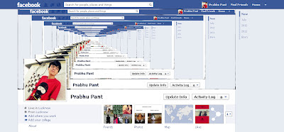
| Wanna create cover like this
|
Though they are not 3D facebook covers, but I like to call them 3D Facebook Covers. You can also save yourself a trouble of creating this. Just like TechBiscuits Facebook Page and you will get a 3D cover (leave comment in this post or message Tech Biscuits if you want a 3D cover). So now to create them, follow these steps (in this tutorial, I am going to show a three layer cover. You can create the above cover by creating several layers.):
- First of all you are required to take screenshot of you
facebook profile page. Make sure that all the ads are hidden. To take
screenshot, open you FB profile page and press Print Screen.
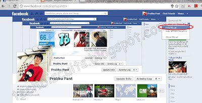 |
| Closing the ads. After Closing, refresh this page. |
- Now go to Photoshop. Press Ctrl+N to open a new blank
workarea. Paste the screenshot in this
box.
- Now you need to erase the portion where your cover photo is
displayed. You can use eraser or rectangular marquee tool. After erasing, make a copy of that image.
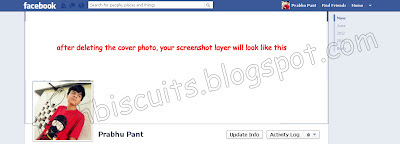 |
| After Erasing the cover photo area |
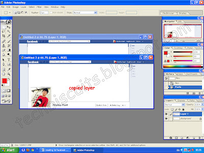 |
| Making Copy of the base image |
- As you can see, the so called ‘3D’ look is on the cover photo
area and the copied image (which you have created in the end of step 3) is
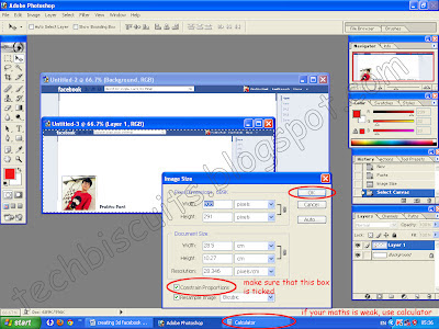
smaller than the base image. So you are now required to reduce the size of the
copied image by 197 pixels. Go to Image-> Image size and reduce the size of
the copied image by 197. Make sure that the Constrain Proportion box is ticked.
 |
| Adjusting the layer's size |
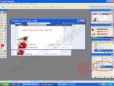
- Now place the copied image in the box of base image. Make sure that the layers are adjusted in increasing order from the top (see the small box in the bottom right corner of the image below.) You can adjust the layers by simply drag and drop.
 |
| Adjusting layers |
- After the layers are adjusted, adjust layer 2 in layer 1 as given in the image.
The video of this How-To tutorial will be uploaded soon, so stay tuned for updates.


hi... this is my profile link,https://www.facebook.com/jabbarnet
ReplyDeletemake photoshop for my profile thank u
hi im princess i want this cover photo..
ReplyDeletei want one too please
ReplyDeletehey I also want 1 plzz...
ReplyDeletei want a 3d cover also
ReplyDeletehey im using a smart phone so i cant leave a link so my facebook name is: florian miftari loli.
ReplyDeletethere should be a coin on the cover photo ��
I also want 3D cover photo for me.
ReplyDeletethanks it works but my maths is weak
ReplyDeleteThank you for the information, I think this article is very useful for all who read it.
ReplyDelete.
I'm on the fence about this, while more customization is good, I have a feeling this is a "in-progress" update, it just feels incomplete and half-way there.
ReplyDeleteWe use badge layout for apps on design approvals (visual projects), so the image being displayed is important. Old layout "feels like" it had larger images,
maybe because the images were cropped more loosely so it's easier to tell which project it was at quick glance. Now the image is cropped closer, making it
harder to scan thru at quick glance. I find myself needing to click into the project more often than usual. Which makes the whole user experience less
efficient.
I have a couple suggestions that might make it work better:
1. Increase the height of the window the cover image is being displayed.
2. Let us to choose which image to be displayed as "cover" (like how Pinterest handles cover images of each board, was hoping for this for a long time)
3. Let us adjust which part of the image to show and how tight or loose the crop is (with a fixed window, let us move the image around and maybe enlarge or
shrink it to control what shows thru the window. Pinterest does a limited form of this, which is very useful in making the cover image relevant)
4. Allow Cover Image to be ordered in different hierarchy (currently every element can be ordered differently except the Cover Image, it seems to be stuck
in the 2nd spot, would like the option to set it on another spot in the layout. This one seems like an easy fix, since you guys allow that for every other
element already)
Pretty good post. I have just stumbled upon your blog and enjoyed reading your blog posts very much. I am looking for new posts to get more precious info. Big thanks for the useful info. sell video online
ReplyDeleteI'm on the fence about this, while more customization is good, I have a feeling this is a "in-progress" update, it just feels incomplete and half-way there.
ReplyDeleteWe use badge layout for apps on design approvals (visual projects), so the image being displayed is important. Old layout "feels like" it had larger images,
maybe because the images were cropped more loosely so it's easier to tell which project it was at quick glance. Now the image is cropped closer, making it
harder to scan thru at quick glance. I find myself needing to click into the project more often than usual. Which makes the whole user experience less
efficient.
I have a couple suggestions that might make it work better:
1. Increase the height of the window the cover image is being displayed.
2. Let us to choose which image to be displayed as "cover" (like how Pinterest handles cover images of each board, was hoping for this for a long time)
3. Let us adjust which part of the image to show and how tight or loose the crop is (with a fixed window, let us move the image around and maybe enlarge or
shrink it to control what shows thru the window. Pinterest does a limited form of this, which is very useful in making the cover image relevant)
4. Allow Cover Image to be ordered in different hierarchy (currently every element can be ordered differently except the Cover Image, it seems to be stuck
in the 2nd spot, would like the option to set it on another spot in the layout. This one seems like an easy fix, since you guys allow that for every other
element already)